Overview
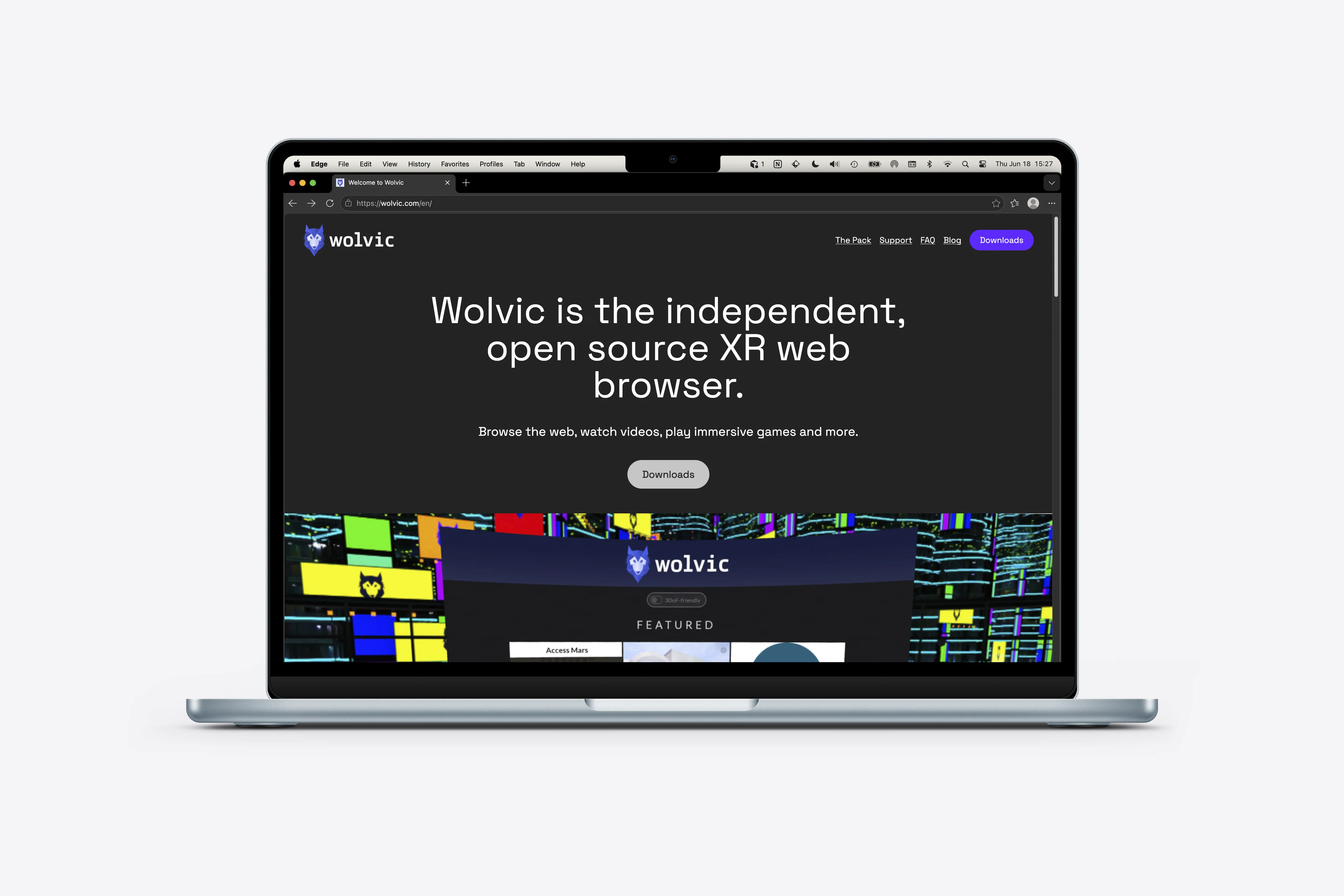
Wolvic helps people browse the immersive web on XR headsets. The redesign focused on clarifying what Wolvic is, who it is for, and how to get started, while reflecting the product's open source identity and XR context.
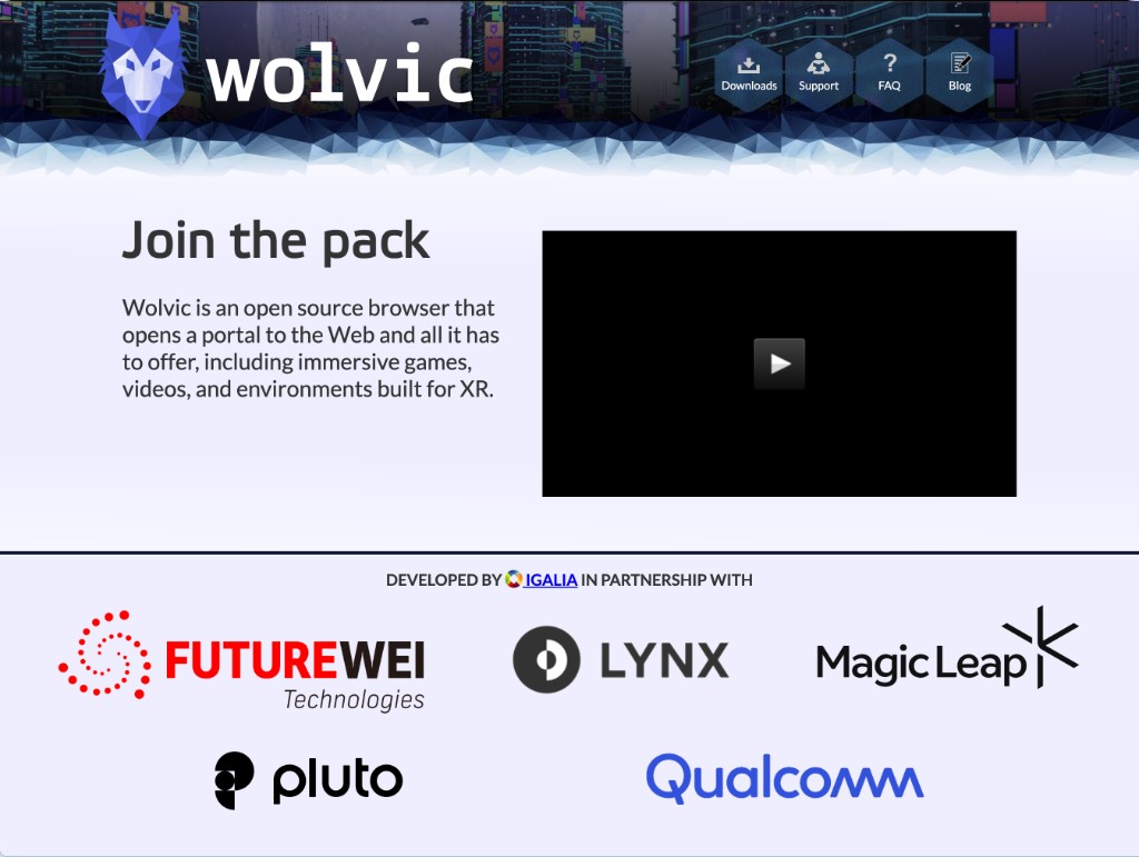
The previous site communicated the right ideas, but they were buried in dense paragraphs. Visitors had to read a lot before understanding what Wolvic was or what to do next. The original homepage opened on a cinematic cityscape and "Join the pack," with the product definition tucked beside a video embed.
The redesign reframes wolvic.com around a clear first impression: an independent open source browser built for XR, with downloads and support paths visible from the hero. It leads with what Wolvic is and where to download it, then layers in detail for readers who want more.
Goals
Improve comprehension for first-time visitors and create a more cohesive marketing experience across the site.
The site needed to better communicate Wolvic's value on XR devices, surface support and download paths, and present Igalia's stewardship of the project with clarity.
As Wolvic matured beyond its Firefox Reality roots, the marketing site needed to speak to two audiences at once: people looking for a browser on their headset, and device manufacturers evaluating an open web stack for their hardware.
The old layout leaned on narrative copy and a decorative cityscape header; useful context, but weak at scanning, device discovery, or partnership outreach. The old site mixed community invitation, partner credibility, and product explanation in a single above-the-fold moment, making both audiences wade through the other's story first.
Process
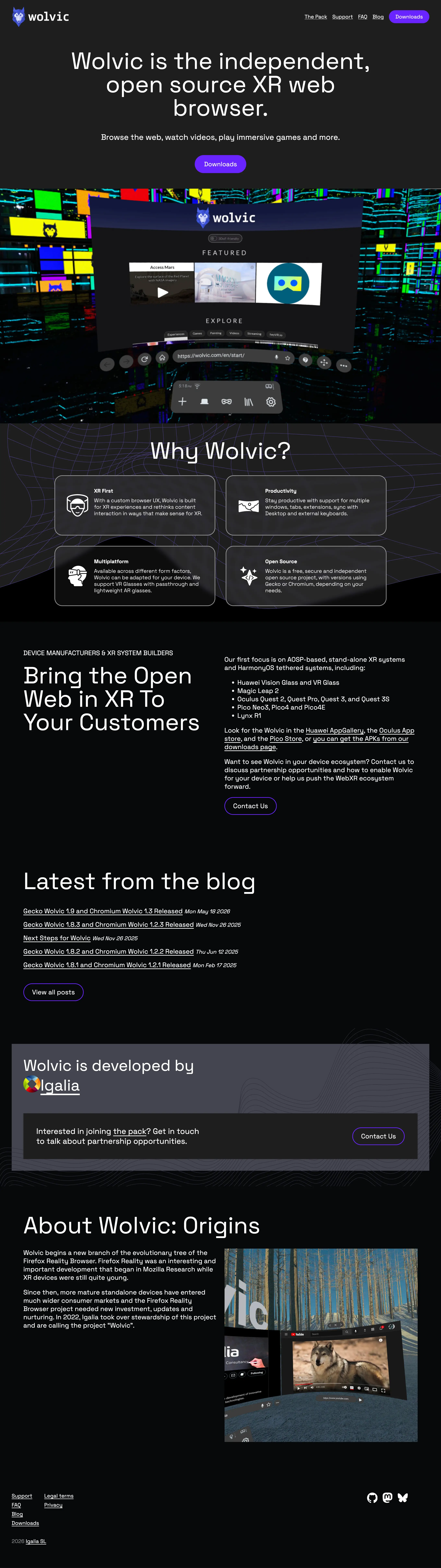
We reorganized the homepage around scannable value pillars, XR-first browsing, productivity features, multiplatform support, and open source, so each benefit could be understood in a glance rather than a paragraph. The light-on-dark split layout was replaced with a cohesive dark interface, and navigation moved from decorative hex tiles to a clearer header pattern. The cityscape from the original website is a screenshot of Wolvic when you're in the XR space. We wanted to keep this reference as a preview of Wolvic's UI, while also making the rest of the website have elements of XR with layers.
Typography shifted from Lato to Space Grotesk while keeping Elektra for display moments, giving the brand a more contemporary technical feel without losing continuity with the Wolvic identity.
A dedicated "device manufacturers & XR system builders" section separates B2B intent from the consumer download flow, with an explicit contact path for partnership conversations.
Outcomes
The redesigned wolvic.com improves structure and visual clarity for visitors learning about the browser.
The new structure surfaces downloads earlier, updates the supported device list as the ecosystem grew, and adds a homepage blog feed so the site reflects an actively maintained open source project.
Partnership and community calls-to-action are clearer with "Join the pack" for contributors, "Contact us" for OEMs, instead of blending every audience into one long scroll. Partner logos and community invitations are still present, but no longer compete with the primary message.
Visit the live site.