webhint.io
webhint is a linting tool that scans any public URL and will give developers hints on how to improve their website with best practices and standards. It started as a website and evolved into a browser extension, a CLI tool, and a VS Code Extension. While the website scanner has been deprecated, webhint was integrated into the Chromium DevTools as the "Issues" panel.
Overview
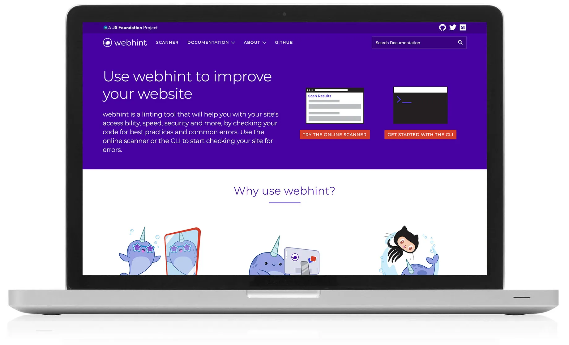
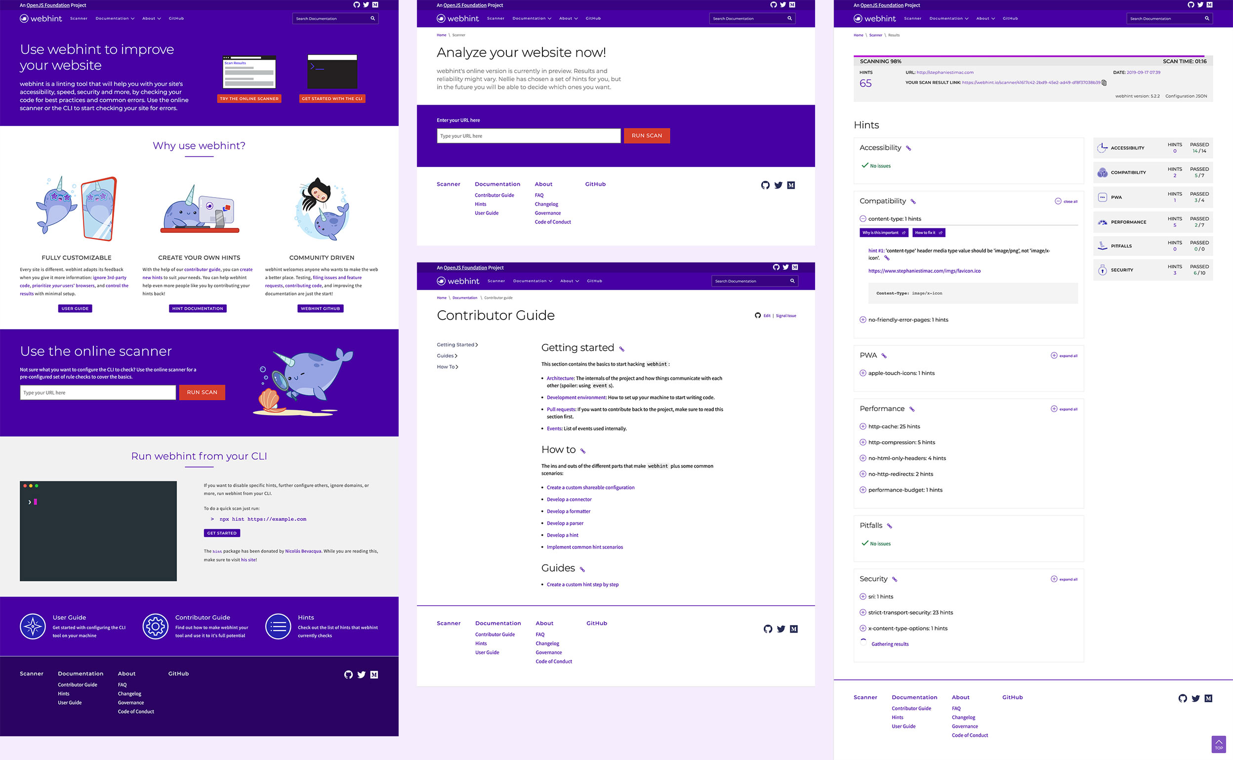
I led the user experience, visual design and front-end development of webhint.io, prioritizing an easily digestible experience. The original site scanner was built to help detect issues with Internet Explorer compatibility and was built into the Microsoft Edge developer portal. As a developer experience and advocate team we wanted to completely separate the scanner from the Microsoft Edge brand in order to remove any sort of company bias from the scan results.
Problems to Solve
Developers do not have an easy way to view results from different tools when linting their code.
Through my initial research, competitive analysis and aggregate exploration of similar tools, it was clear many tools exist to test your code but it takes time to find, install, run and aggregate all the results.
Goals
Provide developers with a configurable solution that utilizes tools already in their existing workflow while allowing them to tailor scan results to the things they most care about and meet them in their environment.
webhint.io aimed to integrate with tools developers were already using, and introduce them to new ones that may benefit them but were easy to opt out of in the experience.
Provide developers with an unopinionated view of their code so that they're building the best website for their needs.
Developers deserve feedback that fits their business problems and doesn't steer them to use certain web technologies that may not be beneficial.
Branding
The branding was to be purposefully and heavily differentiated from any Microsoft branding. The focus was to create a friendly, inviting and playful mood to draw developers in.
webhint went through three name change due to other tooling with similar names. It’s first iteration was Sonar, then Sonarwhal, finally landing on webhint. We first landed on the name Sonar for a scanner which influenced the mascot of the site, Nellie the Narwhal.
In my research, I found that narwhals have some of the strongest echolocation (natural sonar) among sea creatures. The choice for a cute mascot was deliberate. I reserached other projects, like npmjs with their cute groundhog character and the Azure Advocates team with their raccoon illustrations. This cute factor would play into the rest of the user experience of the site further down the road. Despite the name changes, we kept Nellie so that she would be a familiar face to developers who had been using our website through the name changes.
webhint became the final name with the literal meaning that this a tool intended to give you hints about how to improve your website.
Research
We conducted user interviews and gathered feedback about developers' experiences with other linting tools and Lighthouse to help identify what they did and didn't like.
I conducted a competitive analysis of other tools, with a heavy focus on Google Lighthouse. Lighthouse was our key competitor but at the time of our launch. I compared other free tools like Web Page Test and eslint. I ended up comparing at a variety of open source projects to get a feel for how the sites were constructed in terms of information architecture and page layout design. That, with input and feedback from the team, helped drive the initial user experience and design.
Ideation and Early User Experience Exploration
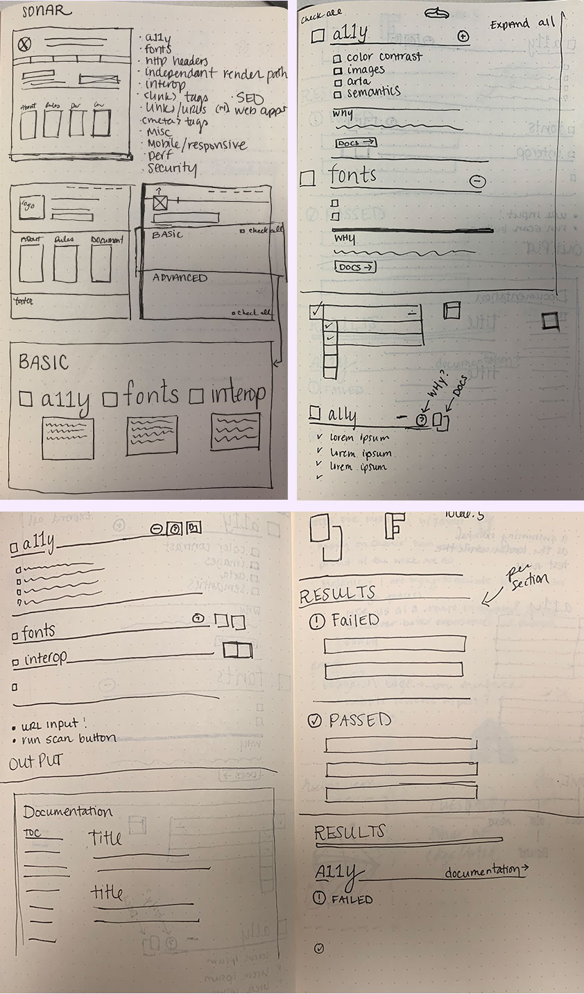
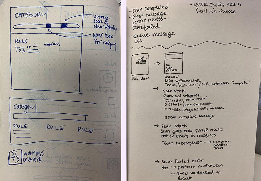
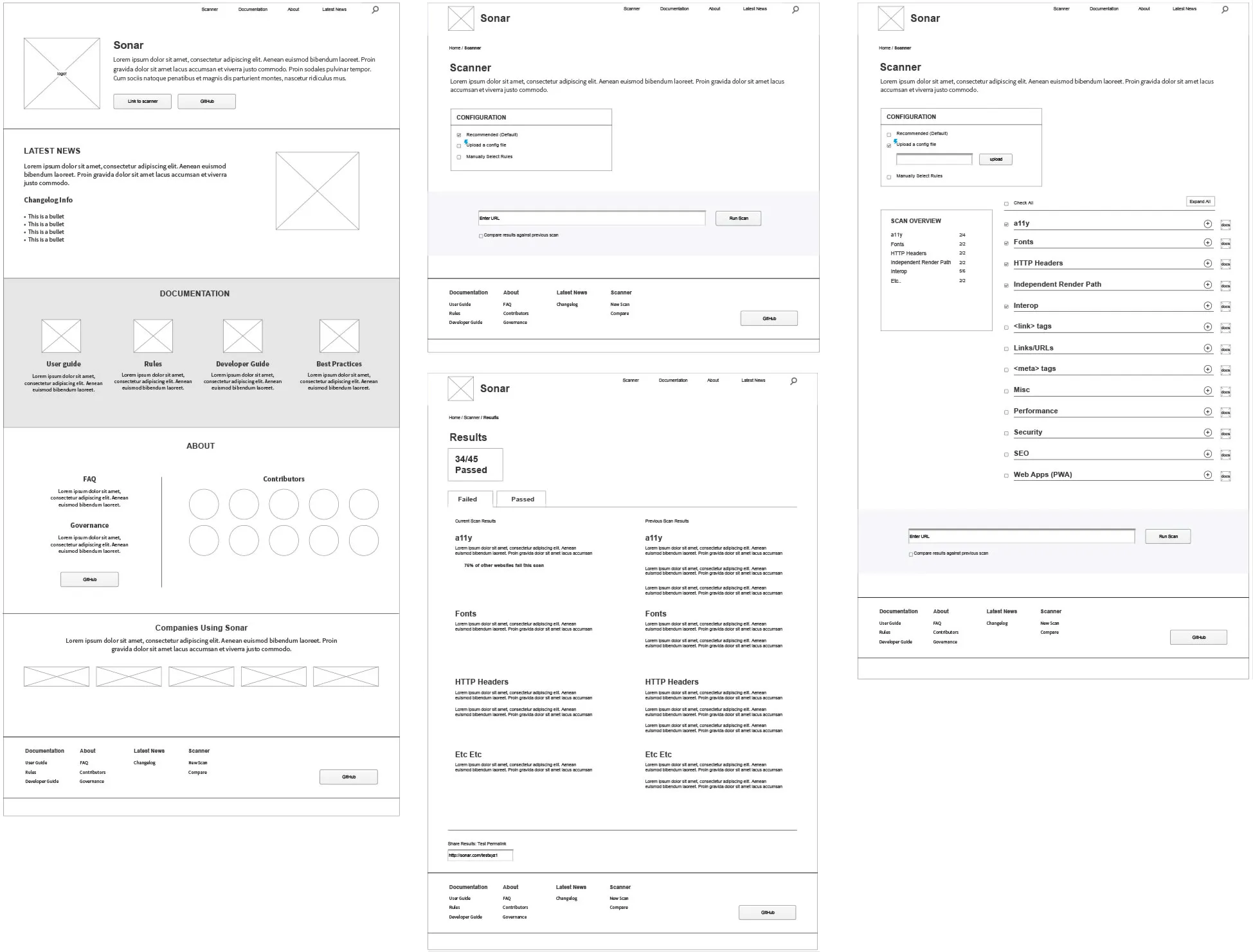
The design needed to be easy to navigate and identify the most pressing issues to be fixed.
I primarily focused on creating a report experience that was easy to read and navigate. Lengthy results from a site scan were possible so to streamline the experience, I focused on a collapsible accordion and a main section navigation in the sidebar that would stick with you as you scrolled down the page.
Implementing Visual Design
The team had no funding for user research so we took feedback about UX via the GitHub repository. I followed established patterns for the layout of the site and was making iterative updates consistently once the initial site launched. We could start to identity spots in the design, that in theory worked, but in practice, once live, weren’t ideal solutions.
One concern I had when building out the website was the fact that the site had to put people who wanted to run a scan into a queue to wait. Even though the project was owned by the JS Foundation, I was concerned because Microsoft employees were the main contributors putting out a new tool. I didn’t want the fact that users had to wait for the site scan to complete to bother them. Our solution was to put the users on a page that gave them a link they could return to later once their scan results were complete. On the page there was a picture of Nellie the Narwhal, working furiously away on her computer in the dark, concern and sweat dripping down her narwhal head, next to a headline that said “Nellie is working overtime right now” and an additional caption to let the user know what was happening.
Someone tweeted shortly after this implemented, “I wanted to be annoyed I had to wait for the scan, but I just felt bad for Nellie instead ☹.” This delighted me, as this was the exact response I was hoping for from a developer. Eventually, as the backend infrastructure of the site improved, we no longer needed to put users into a queue and this experience was removed from the website.
Results
Over the course of my time of on the project from 2017-2019, we reached over 500,000 site scans by developers on the webhint.io website.
Another result of the project was a growth in a favorable view of the Edge DevEx team. This is hard to quantify, but this project helped us reach new audiences. A large part of that was because of Nellie the Narhwal and developer swag we created for events. She's been featured on stickers, t-shirts and even socks and was a key element to the marketing strategy for webhint.