Overview
Servo sits at the intersection of browser engineering, open source contribution, and sponsorship. The redesign aimed to make the project's story, momentum, and entry points easier to discover for both technical and non-technical audiences.
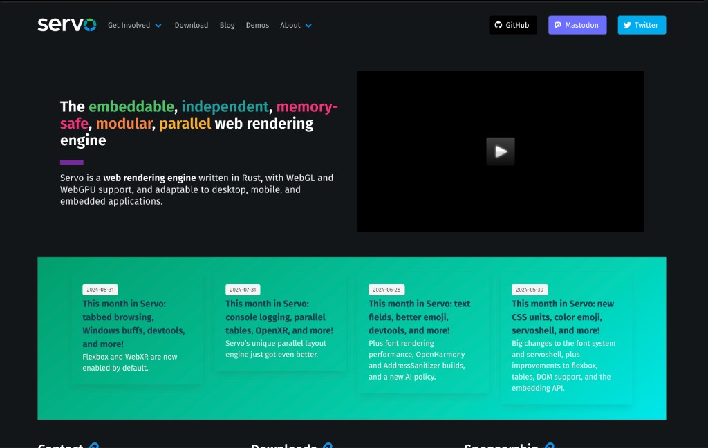
The previous site led with a rainbow stack of adjectives "embeddable, independent, memory-safe, modular, parallel" beside a video embed. It communicated Servo's technical strengths, but asked visitors to parse a dense headline before understanding what the engine is or who it serves.
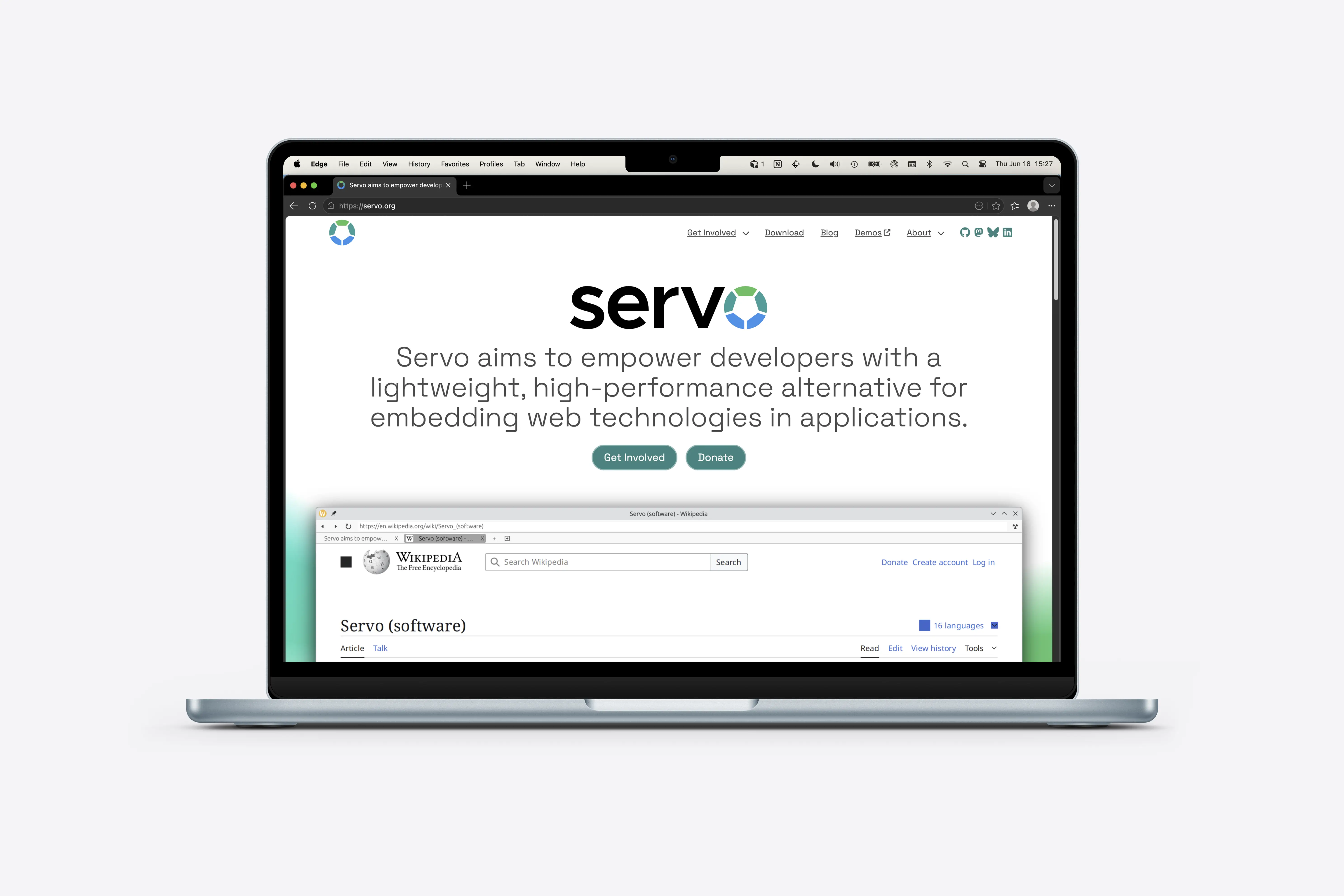
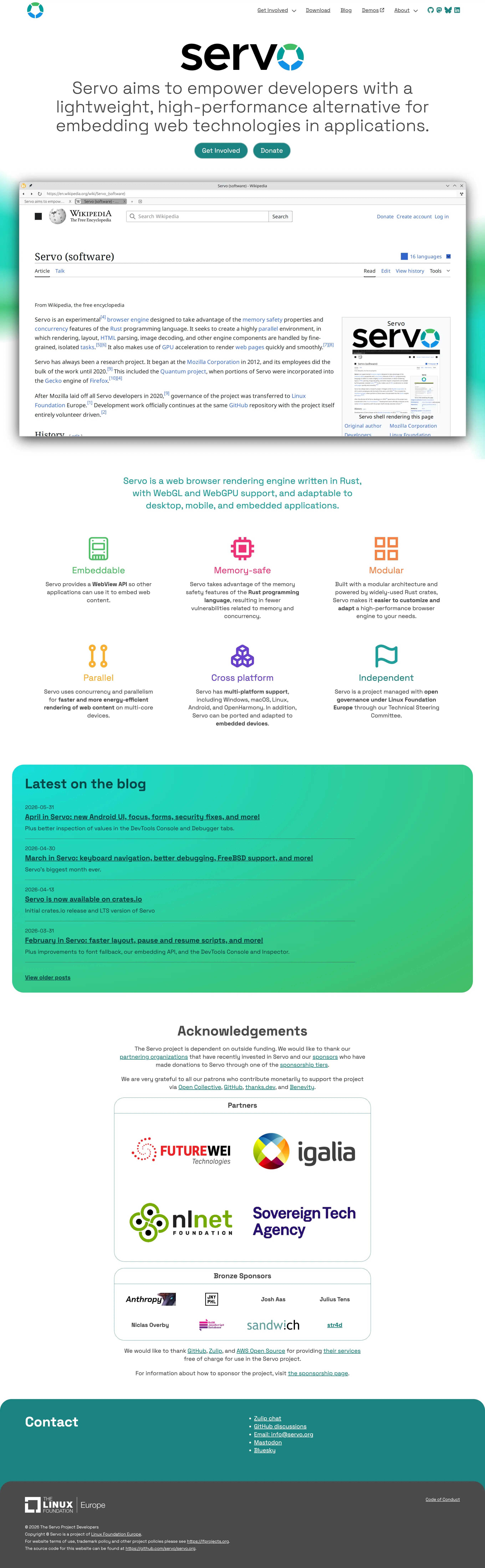
The redesign reframes servo.org around it's vision statement: to be a lightweight, high-performance rendering engine for embedding web technologies. It leads with that value proposition, then breaks technical strengths into scannable pillars for readers who want detail.
Goals
Clarify what Servo is today and create a more approachable path into the project's documentation, community, and sponsorship opportunities.
The site needed to better balance technical credibility with readability, while giving blog updates, downloads, and contribution paths a clearer home.
As the Servo project revitalized and received more interest and participation, the marketing site needed to speak to multiple audiences: developers evaluating the engine, non-technical product managers looking for an embedder, contributors looking to get involved, and sponsors supporting the project's future.
The old layout leaned on a colorful hero headline and a prominent video placeholder, with monthly updates in a high-contrast teal band. Useful for showing momentum, but the page mixed product definition, community news, and sponsorship paths without a clear hierarchy for first-time visitors.
Process
We reorganized the homepage around the scannable value pillars: embeddable, memory-safe, modular, parallel, cross-platform, and independent, so each strength could be understood at a glance rather than decoded from a single sentence.
The hero shifted from a list of technical adjectives to a developer-focused value statement, with the Rust engine description and feature cards doing the explanatory work the old headline used to carry alone, but without successfully explaining what the benefit of each feature is. Not everyone who lands on the page will know what it means to memory-safe or parallel or modular so we wanted to make that clear.
Blog updates moved from a horizontal card strip into a dedicated "Latest on the blog" section, keeping release momentum visible without competing with the primary product story above the fold.
An acknowledgements section gives sponsorship and partnership context a clearer home, separating funding gratitude from the engine overview and contribution paths.
Outcomes
The redesigned servo.org improves clarity and navigation for visitors learning about the engine.
The new structure surfaces what Servo is and who it is for earlier, expands the feature set to include cross-platform support and open governance, and keeps the blog feed as evidence of an actively maintained project.
Downloads, contact, and sponsorship paths are easier to distinguish. The site reads like a mature open source product with clear entry points for developers, contributors, and partners, not just a landing page for developers only.
Visit the live site.