Overview
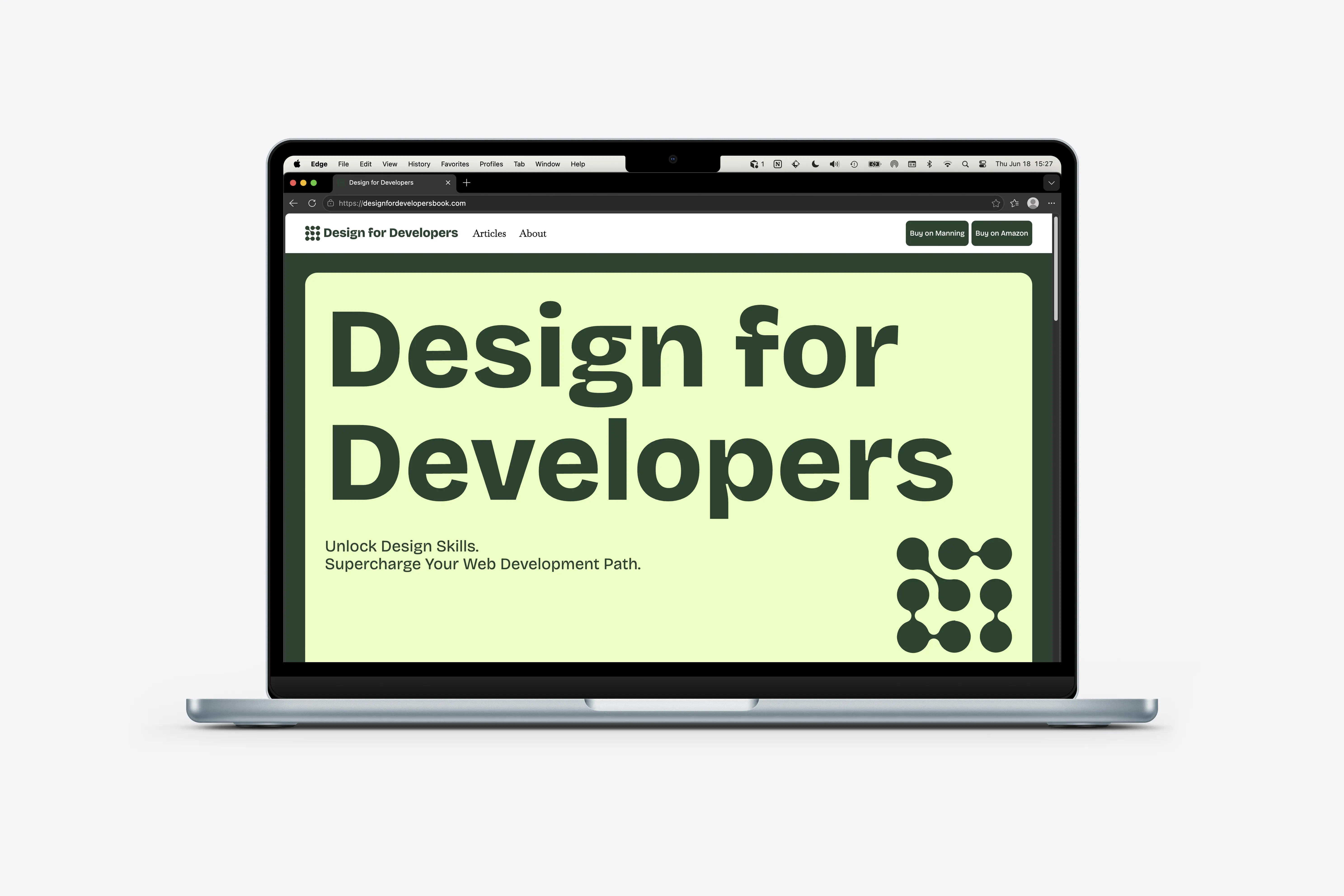
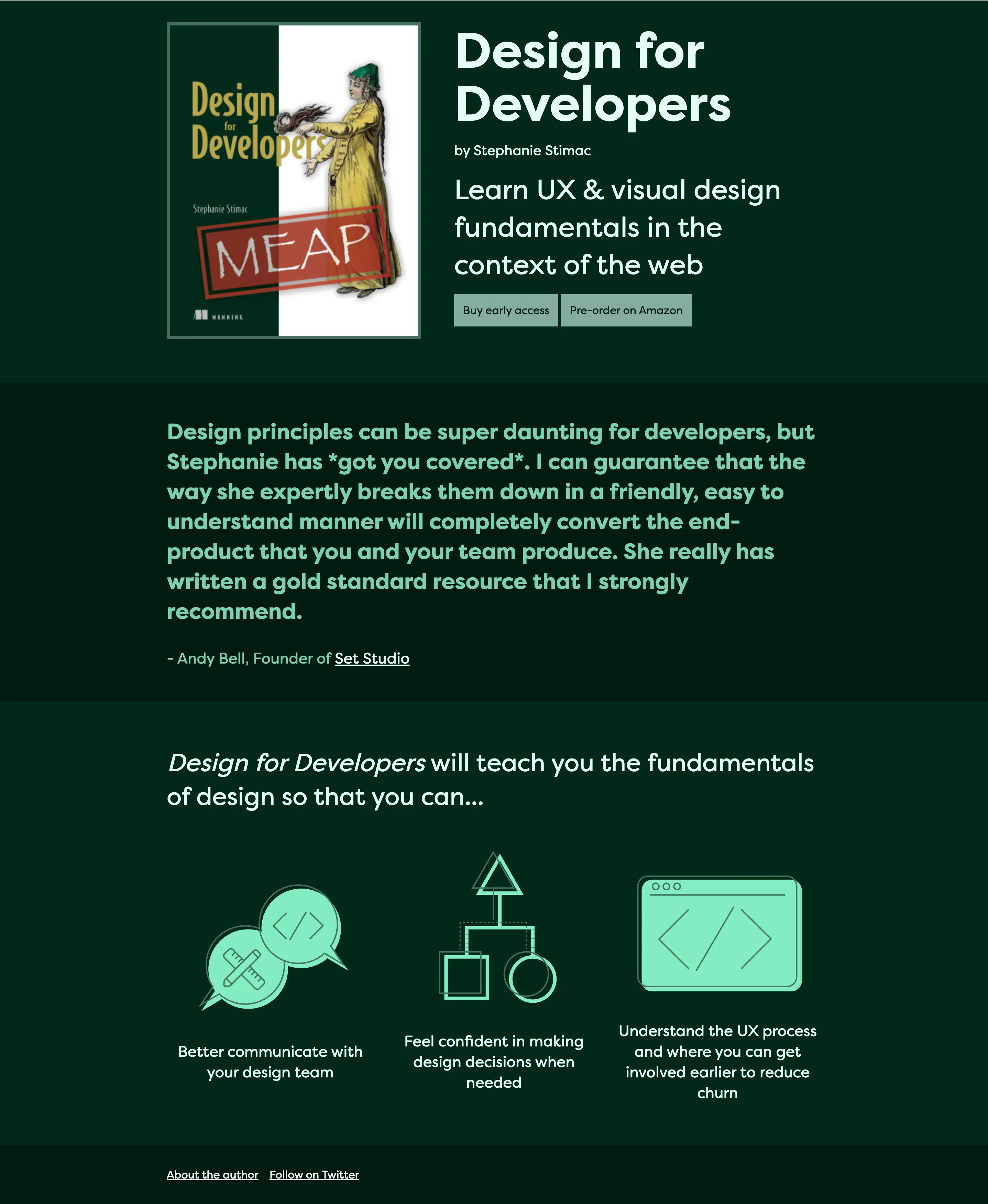
Design for Developers was published in 2022 via Manning Publishing. I had intially built a basic one page website to help with marketing. It was very simple with links to the book, a review highlight about the content, and a few high level points on what the book teaches you. After the book launch, I felt that the site needed to reflect the fundamentals the book teaches.
While the book focuses on the fundamentals of design that help developers build better websites, there is so much more at the intersection of design and code that could be written about.
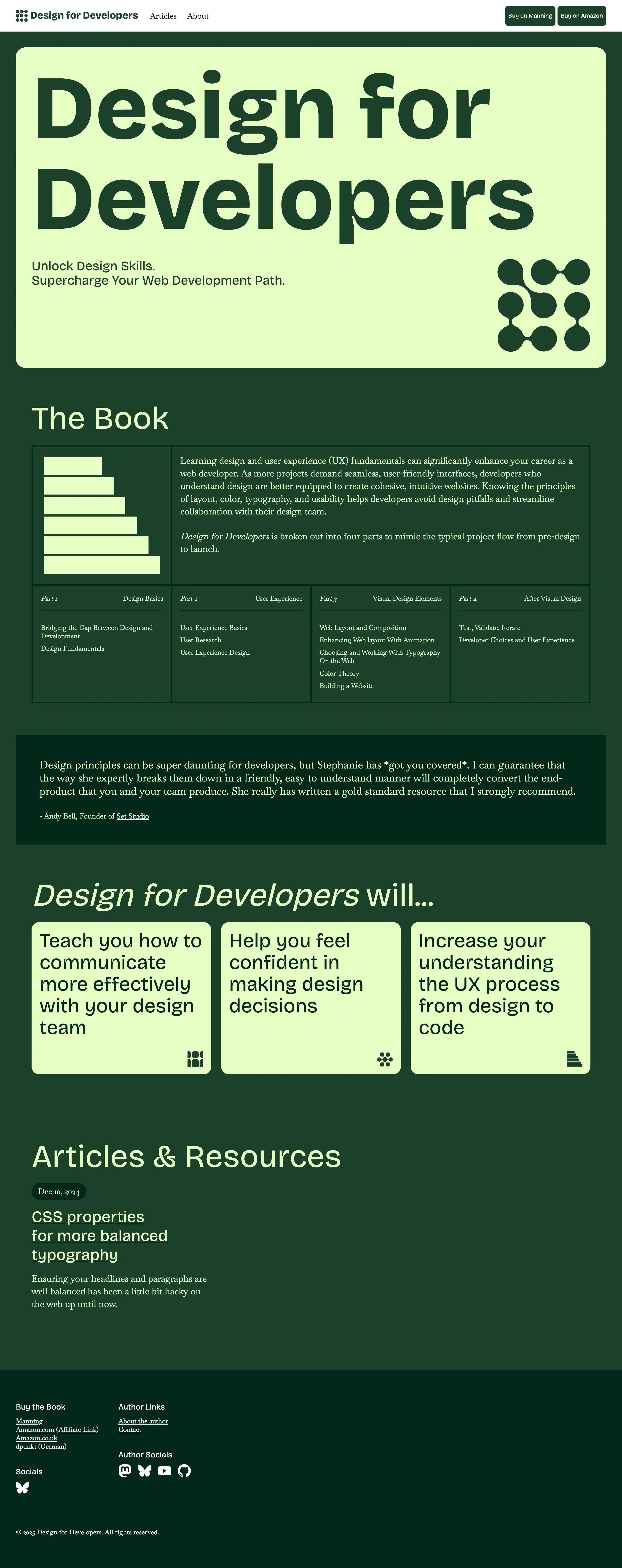
The redesign structures the site around the book with clearer hierarchy, stronger typography, and dedicated space for articles and resources to grow over time.
Goals
Create a marketing site for the book that reflects the design principles taught in the book with strong color and typography and clear hierarchy.
Additionally, the website should become a hub for content focused on the intersection of design and development.
Process
Because the book is not self-published, the cover adhere's to Manning's cover style. I wanted the website to feel more modern but still have ties to the book cover and used this as my starting point. I developed the color palette using the green on the cover, and using a monochromatic color palette allowed me to use a bright accent color to create bold contrast on the page.
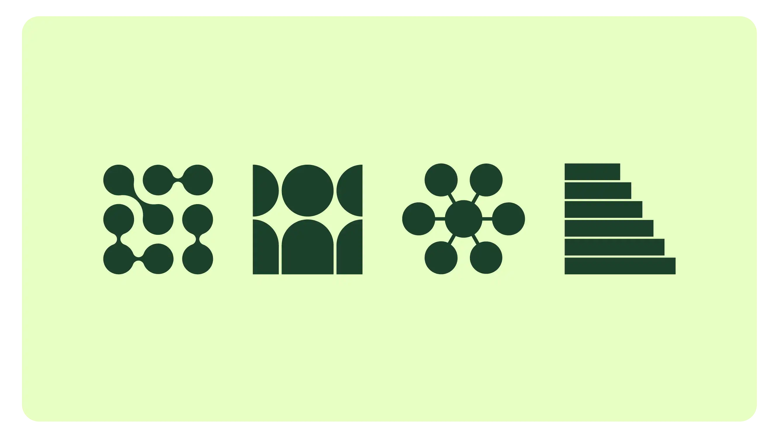
To help create visual interest, I used simple and abstract iconography where appropriate and leveraged contrast of color and large typography to draw the visitor's eye down and through the page.
Outcomes
The redesigned site launched as a modern, more structured site with improved hierarchy and a stronger foundation for future updates. The color palette and typography also provided a light design system that I could use on social media or other websites as marketing material to promote the book.
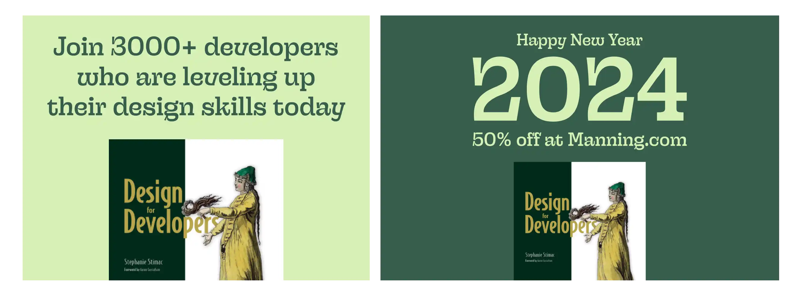
Implementation of the writing and resources section is still underway.
The new layout gives the book a clearer focal point while leaving room to grow into the content hub described in the project goals. Sections are easier to scan, and the visual language — bold type, restrained palette, simple iconography — demonstrates the same hierarchy and contrast principles the book teaches.
Extending the site palette and typography into social and promotional graphics also made marketing feel more cohesive. The redesign turned a launch landing page into a foundation the site can build on as new writing and resources are added.
Visit the live site.