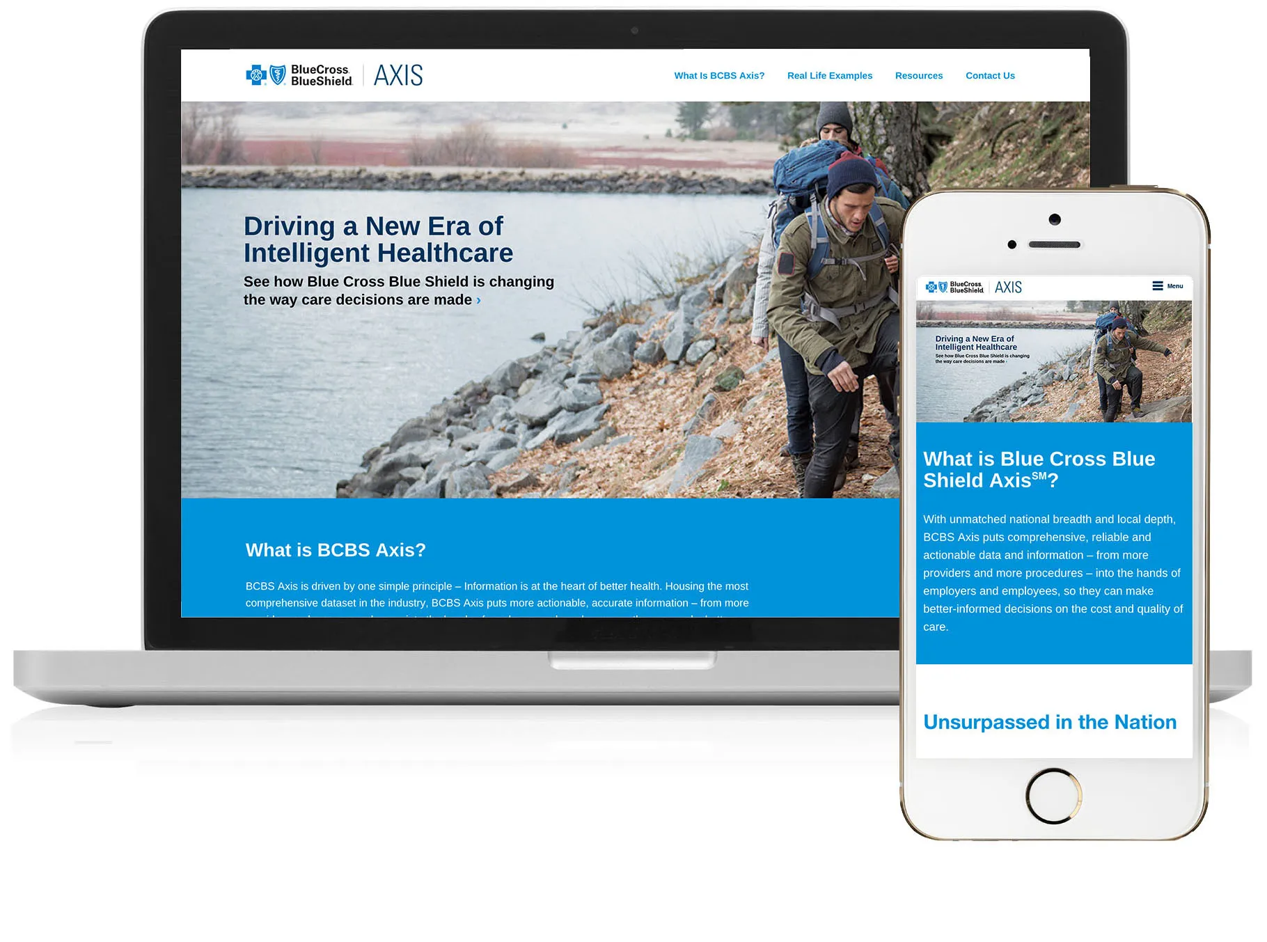
BCBS Axis Marketing Microsite
Blue Cross Blue Shield came to us with a need for a marketing landing page for their new product BCBS Axis, a rich data resource aimed at providing insights into better healthcare decisions.
Overview
I led the user experience and visual design of the website, collaborating with a content strategist to build out the content of the website. I was also responsible for front-end development, delivering a responsive and mobile friendly experience across major browsers.

Goals
Create a marketing landing page for BCBS Axis that provides an overview of the product, access to case studies and other resources.
Blue Cross Blue Shield’s ask was for a marketing page, and they provided a few resources they had but no additional content. They looked to WE Communications to provide content guidance on the page. Initially my content strategist recommended just putting the resources they had provided as the only content on the page, but from a wholistic UX perspective this didn’t seem like enough.
I made the following content recommendations:
- Provide an overview of the product with key features
- Provide information about the security of the data
- Re-purpose infographics WE Comms designed for case studies for the website
- Re-use plan finder widget from the BCBS site

Visual Design and Tech Stack
To create a cohesive brand feel, the BCBS Axis microsite had the same look and feel as the main BCBS website.
Visual design decisions were restricted to the Blue Cross Blue Shield brand guidelines, utilizing their typography, their imagery and their color palette. As part of the marketing push, WE Communications was also responsible for developing case studies and visuals. To tie these materials with the website, I used the same imagery and infographics.
I took style patterns from Blue Cross Blue Shield's home page and applied them to the BCBS Axis microsite to create consistency.
I delivered the following design and was responsible for coding. Due to the simplistic nature of the website and having no advanced interactivity, I built the website in HTML and CSS, testing cross-browser to ensure there were no compatibility issues.

Conclusion
Successfully delivered a mobile friendly, responsive website to Blue Cross Blue Shield.
The response from our clients at Blue Cross Blue Shield was positive. While the website was one part of the marketing plan, they were thrilled with the content recommendations provided when wireframing and how I was able to use pieces from other bits of collateral to further tie the marketing launch assets together into a cohesive unit. The deliverable was the final website code, handed over to BCBS to upload and manage themselves.